Academy are the gambling experts, gathering years of experience in the gambling industry. Through their training activities over the years, they have accumulated the knowledge and experience that is now being presented taught through their programme.
Tasked with designing and developing the new brand, Academy is fun, engaging and whimsical with and emphasis on bringing training to life.
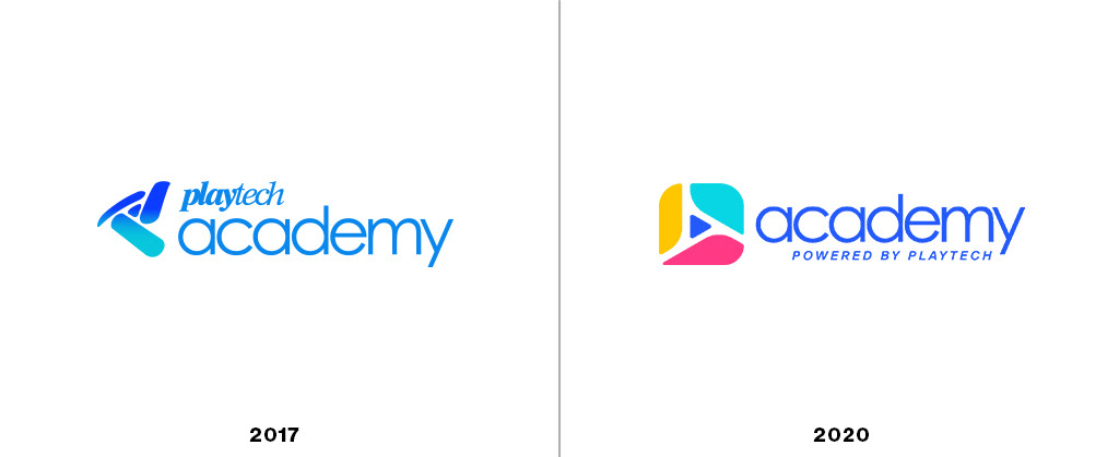
The new logo
The long-standing brand has built up years of brand recognition in the gambling industry. Taking what was working well with the previous logo and refining its form to emphasise the "A" letter, as well as incorporating a triangle as a reference to Academy's parent brand, Playtech. A vibrant colour palette brings excitement, fun and energy to the originally corporate brand.

Finding the right type
The typeface of the brand was updated to be modern and clean, with just enough character. A typeface flexible enough to work well across large printed displays down to small digital screens. Academy has one typeface family - Helvetica® Now - that has been selected to provide clarity, simplicity and neutrality, used for, titles, subtitles and running text.

Brand colours
Bold, diverse and fun. The Academy brand colours are a reflection of its wide audience. It’s also used to colour code and or organize various design systems across the brand. The brand colours are referenced from the logo and carry on through the 2D and 3D assets.

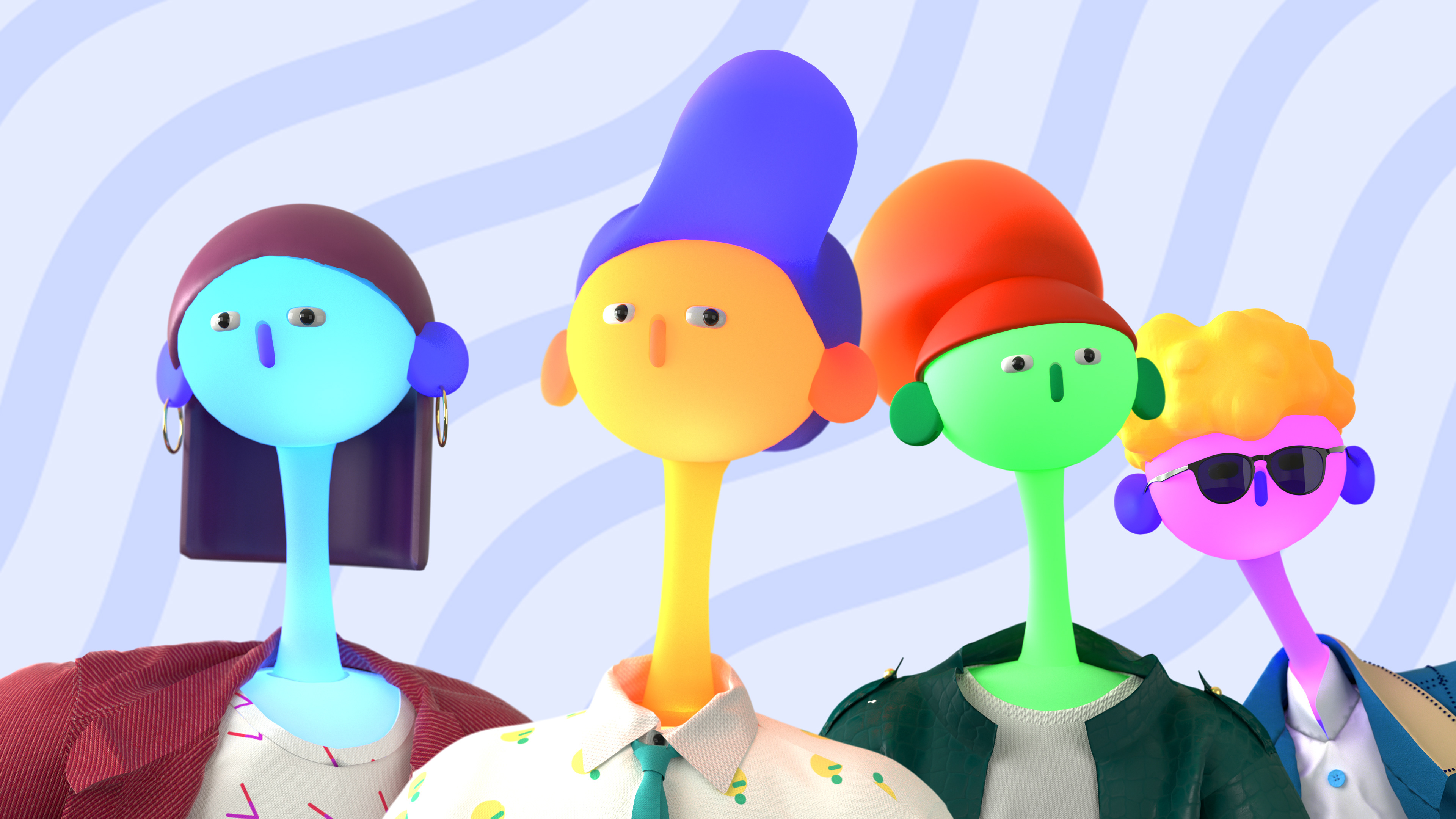
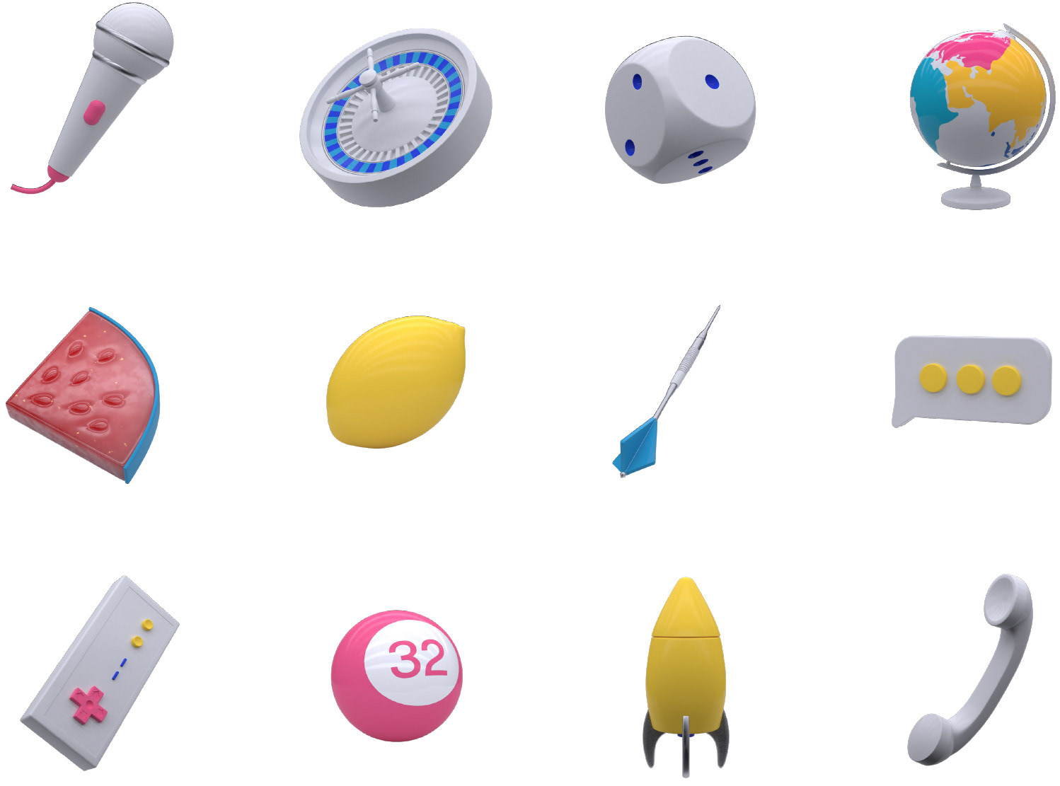
3D assets
Fun, vibrant and exciting the style of Academy is pushed further through dynamic and exciting 3D characters, iconography and other 3D elements. The 3D characters are a perfect way to associate different categories of training with easily recognisable faces.

2021 Rollout
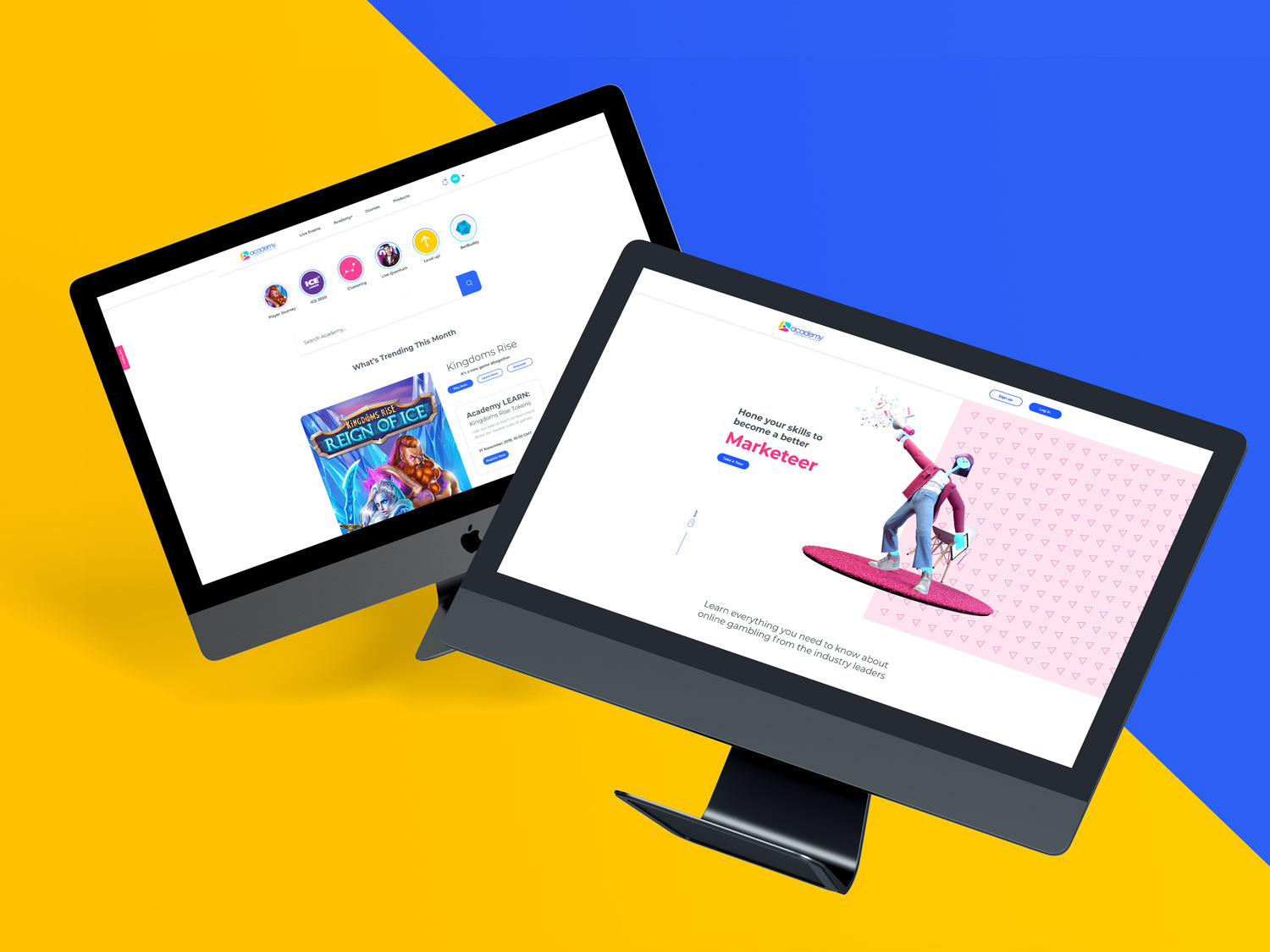
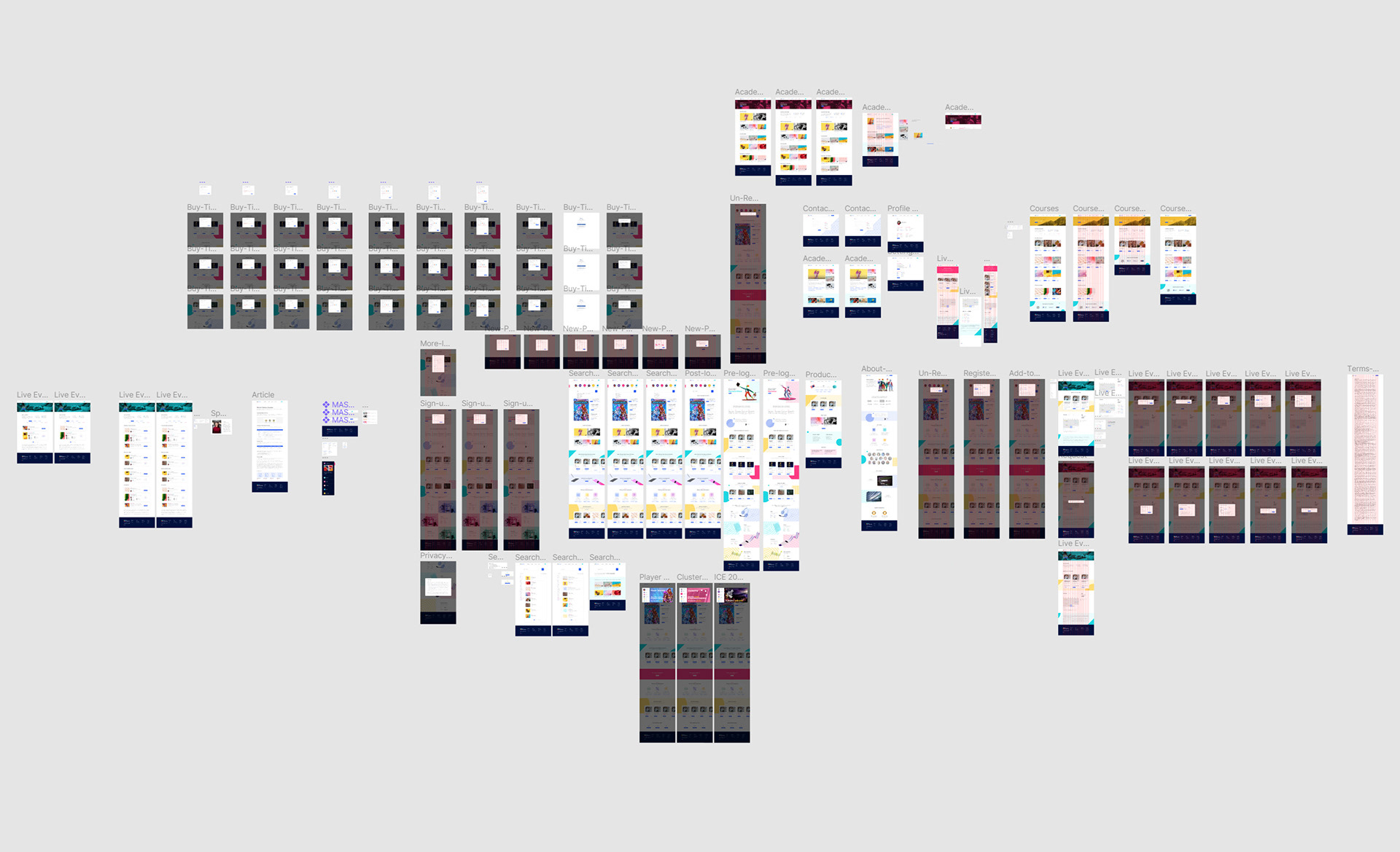
In addition to the brand’s identity system, the project resulted in creating a new website, social campaign, and printed and digital collateral.