


Britain is a Greggs nation, and one of the last remaining constants on the high street. While the rest of the retail trade struggles, Greggs continues to supply one of the UKs most important staples – bread, alongside cakes, pastries, sandwiches and coffee. But big shot competitors such as Starbucks and Costa are stealing away customers, with their trendy and up to date image.
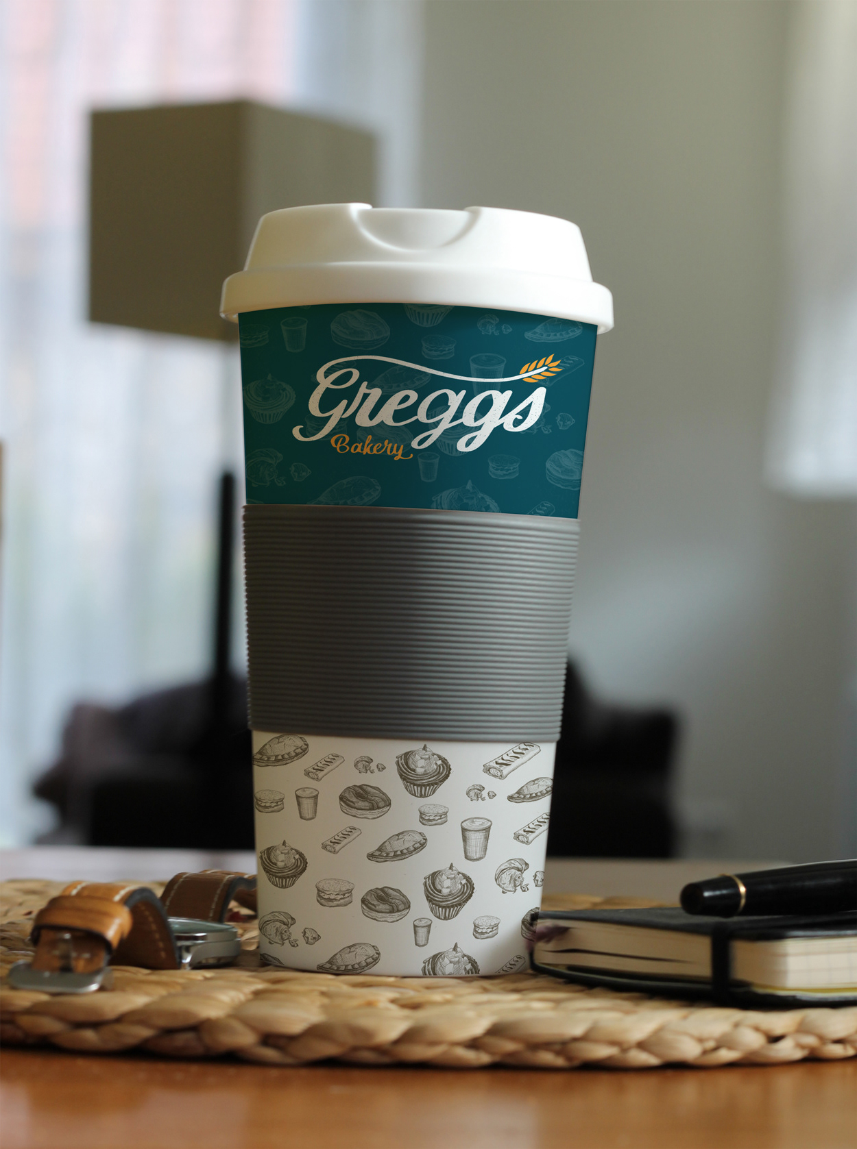
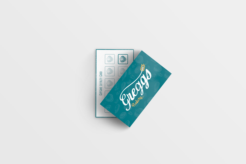
The re-imagined brand reflects the heritage of Greggs, with a more charming logo reminiscent of vintage signage, alongside hand drawn imagery of the food they sell. The dark teal is a variation of the existing brand colour, but instead gives a more calming feel to brand, reinforcing it's familiarity and history.
The logo itself is hand drawn to give it an authentic and homely feel, a stark contrast to the original logo design.
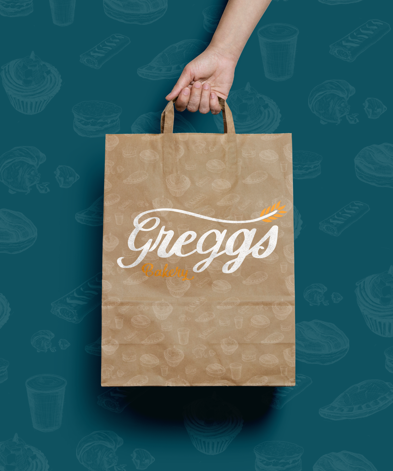

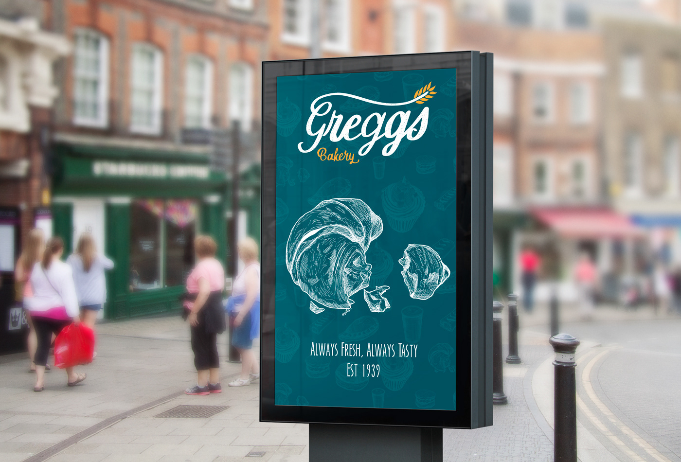

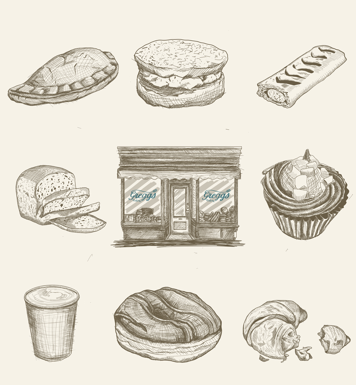
These are the hand drawn vector images I created for this re-branding case study.